10 Most Iconic Movie Franchise Logos Of All Time, Ranked
Many of the greatest movies ever have a key factor in common: their movie logos quickly made an impression on viewers. Bold lettering, memorable icons, and striking color combinations can all contribute to effective movie logos. It is useful to know how the logos fit into their franchises and what they offer to their films’ legacies.
There are plenty of stories to be told when it comes to movie artwork and development, and there is so much more to a logo than meets the eye. Which film series has the most iconic, unforgettable logo?
10 Dirty Dancing

Jennifer Grey and Patrick Swayze lit up the screen with their passion in Dirty Dancing (1987). Their close pose on the movie poster is just as iconic as the sexy purple lettering for the film’s logo. As beloved as that brush-drawn font and those alliterative words are today, Dirty Dancing could have been called I Was a Teenage Mambo Queen. Thank goodness the movie poster turned out as it is with the name that fans know and love.
9 Harry Potter
Harry Potter’s logo is emblematic of the lightning-bolt scar Voldemort left on baby Harry, and fans are accustomed to seeing the lettering in various colorations across the franchise. The movies, books, video games, and other merchandise are marked by the logo, which was originally created by Mary GrandPré. GrandPré was able to read J.K. Rowling’s Harry Potter books before the general public in order to create her illustrations for cover and chapter art according to each story.
8 The Godfather
Graphic designer S. Neil Fujita created the logo for The Godfather (1972) before it was even a movie. Fujita’s design was used for the release of Mario Puzo’s novel. Fans of the famous film series can’t imagine any logo other than the “puppet strings,” but Paramount did not want to use the classic insignia for the first film.
Since Mario Puzo was Francis Ford Coppola’s co-writer for the movie script, Coppola stood his ground to retain S. Neil Fujita’s logo with Puzo’s name included on the poster.
7 Ghostbusters
The logo for the Ghostbusters franchise has to be one of the cutest and most popular of any movie series. National Lampoon magazine’s celebrated art director, Michael C. Gross, was also a film producer and graphic designer. The New York Times reported that Gross created the logo with artist Brent Boates, using the “no” symbol “to print a teaser poster at a time when the studio had not yet secured the rights to the [Ghostbusters] name.” In addition to giving the franchise an instantly recognizable face, Michael C. Gross was also a producer for the first two movies.
6 E.T.
Whether it is alone or accompanied by Elliott bicycling with E.T. bundled up in his basket, the E.T. logo is a huge part of the movie’s lasting cultural impact. Just seeing the initials above the subtitle evokes so many images and feelings from fans of the film. John Alvin and Drew Struzan are both listed as poster artists for E.T. Director Steven Spielberg’s production company, Amblin Entertainment, opened in 1981 and took on the silhouette of Elliott and E.T. on the bicycle as part of its logo.
5 Batman
Spanning comic books, action figures, other products, and television and film, Batman is one of the most pervasive franchises of the current and previous century. Of all the logos used in various Batman media, the Bat-Signal image is what most fans of the classic movies would first envision. The Bat-Signal’s first appearance was in Detective Comics #60 in 1942. As the logo continues to evolve over time, the Bat-Signal will always remain important to the legacy of the whole franchise.
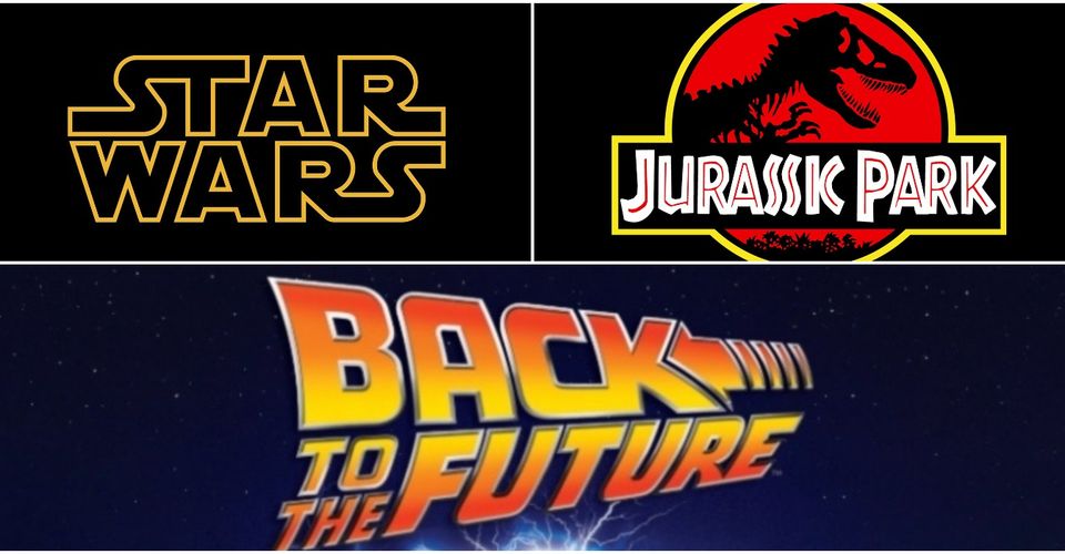
4 Star Wars
Of all the space sci-fi movies in the world, none have logos quite like the bold letters that spell the Star Wars title. Logo designer Suzy Rice told The Hollywood Reporter that George Lucas asked her to make the design “very fascist,” “intimidating,” and something that would “rival AT&T.” To craft the logo that has now represented the franchise for over four decades, Rice read about German type design, which led her to select Helvetica Black.
3 Back To The Future

Drew Struzan’s Back to the Future poster artwork is legendary. While the DeLorean might take the cake as one of the movie’s biggest symbols, the logo with the movie’s title is a strong identifier of the trilogy. The lettering is evocative of time travel, especially with the arrow leaning into the “k” on “Back.”
Other little details convey the past and future tenses of the movies. “Back” leans to the left while “to the Future” leans to the right. Add in Marty McFly and Doc checking their watches, and the revolutionary stories from the trilogy can be relived in the blink of an eye.
2 James Bond
The James Bond franchise’s 007 logo has seen many shifts since its first appearance in 1962. Mitchell Hooks and David Chasman have both been credited with the poster art of the first James Bond movie, Dr. No. Just as Bond has been portrayed by several different actors over time, his Agent 007 marker has adapted with the many film adaptations of Ian Fleming’s writing.
1 Jurassic Park
Jurassic Park (1993) was only the beginning of an ever-growing movie series. In addition to watching the films and purchasing Jurassic Park paraphernalia, many fans have fond memories of enjoying the water-based theme park ride at Universal. Every part of the franchise can be identified by the striking logo, which had its genesis in Chip Kidd’s dinosaur skeleton emblem for Michael Crichton’s 1990 Jurassic Park book. Steven Spielberg opted to continue without a real-live dinosaur in the logo, and a marketing executive named Tom Martin gathered a team to finish off the Universal logo. John Alvin was also an artist for the movie poster.
About The Author
Best Posts


Related Posts
Batman Beyond: The Death of Bruce Wayne Will Set Terry McGinnis Free
After Bruce Wayne’s shocking death, Terry McGinnis must now wrestle with the turmoil of being Batman alone for the first time in his life.

Warzone Pacific Caldera: The Best Owen Gun Loadout
Warzone Pacific Caldera has introduced a plethora of guns such as the Owen Gun. This SMG is a powerful force with the right loadout equipped.

RHOC: Nicole James’ Lawsuit ‘Blindsided’ Heather Dubrow’s Husband Terry
Terry Dubrow was ‘blindsided’ by the mention of an old lawsuit involving Nicole James at Heather’s extravagant party during the premiere of RHOC

Big Brother: Robyn Kass Was Fired From BB23, Claims RHAP Host Brent Wolgamott
Rob Has a Podcast host Brent Wolgamott is claiming that longtime casting director Robyn Kass was fired from Big Brother 23. Find out what he said.

The Simpsons: 10 Reasons We Can All Look Up To Lisa
On The Simpsons, Lisa is hands-down the most admirable character in her family — and maybe even the entire show. She is truly an inspiring role model.

The Flash Confirms [SPOILER] Still Happens In Barry’s Future
On tonight's season 5 premiere of The Flash, Barry's daughter, Nora just revealed a major bombshell about Barry Allen's future.
The Joker Gave DC’s Mightiest Villain His Most EMBARRASSING Defeat
When the Joker managed to steal Mr. Mxyzptlk's massive cosmic powers, he used them in insane ways and got one of DC's top villains to surrender.
Lucifer: 10 Hilarious Quotes From Each Main Character
Lucifer is a series that is well known for it's rapier wit, and here are the funniest lines uttered by the main characters.