20 Unused Supervillain Concept Art Designs That Would Have Completely Changed The Movies
Everyone loves a good villain– it’s a fact that has become undeniable in the golden age of superhero movie. Audiences have long loved the stories of superheroes’ amazing feats, but those stories are only as good as their antagonists.
We may come for Batman, but we stay for the Joker. Fortunately, Marvel and DC have decades worth of incredible supervillains that have slowly found new life in recent film adaptations.
Marvel and DC have paraded out an array of fan-favorite supervillains, some memorable and fascinating and others miscast and underdeveloped.
However, many of these movie supervillains started very differently in the concept stage. Only later were they changed into their final form, for better or for worse.
If the production teams had stuck with their early designs, many of our favorite superhero movies would have been drastically different.
The filmmakers for superhero movies have a wide array of choices, either drawing on the rich comic book history of their villains or striking into completely new territory with a version that was never seen in the comics.
An array of loved and hated villains, ranging from Green Goblin to Killmonger, almost took on greatly different forms.
Here are the 20 Unused Supervillain Concept Art Designs That Would Have Completely Changed The Movies.
20 Deadpool – X-Men Origins: Wolverine
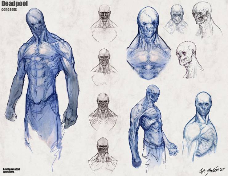
Deadpool’s treatment in X-Men Origins: Wolverine has long been a source of anger for comic book fans. During the course of the experiments on Wade Wilson, his mouth is sewn shut, and he is given the abilities of several other mutants in addition to his own abilities.
It was so far from Deadpool’s talkative and humorous personality in the comics that it was largely ignored by later movies.
The production theme went through many designs for Deadpool’s mutated appearance before settling on the sewn mouth.
In some designs, Deadpool’s mouth is actually malformed as a result of the experiments, which somehow seems both better and worse than having his mouth purposefully sewn shut.
At the least, it shows there were different versions of Deadpool in development, and one of those may have been less terrible.
19 Black Cat – Spider-Man 2

Spider-Man 2 was supposed to feature more villains than just Doctor Octopus. The original concept also included Black Cat and the Lizard. Although the Lizard eventually found his way into a different Spider-Man movie, Black Cat has not had the same luck.
She was cut from Spider-Man 2, and she was supposed to appear in the cancelled Spider-Man 4 and a future Amazing Spider-Man movie. Black Cat is scoring 0 out of 3 on getting into a Spider-Man movie.
This early concept art by James Carson shows what Black Cat would have looked like if she had made it into the final script.
She would likely have followed her role in the comic books as the sometimes romantic interest of Spider-Man, completely altering the dynamic of a movie that ended up largely focusing on Peter’s relationship with Mary Jane.
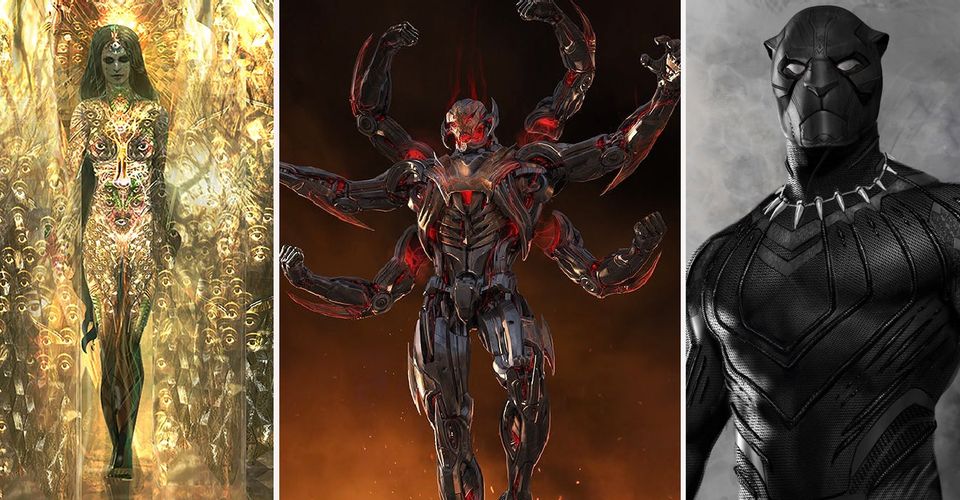
18 Ultron – Avengers: Age of Ultron

Ultron was one of the MCU’s few truly memorable villains, but James Spader’s portrayal did not always strike the right note for fans.
Ultron did not feel like the true threat he could have been for a superhero team-up movie. Spader’s suave and refined air combined with a body design strongly reminiscent of Iron Man did not present a challenging villain for the Avengers.
This concept art by Josh Nizzi shows two different version of Ultron that were in development. The first design is sharper, clawed, and larger– a design intended to be menacing from the start.
Alternately, the second design maintains a larger, sharper look while adding four more arms into the equation. Both of these designs would have provided an excellent contrast to Spader’s classy voiceover and made Ultron feel like the extinction-level threat he should be.
17 Baron Zemo – Captain America: Civil War

Captain America: Civil War‘s Baron Zemo was a significant departure from the Zemo of the comic books. Baron Zemo is orchestrating events from behind the scenes rather than appearing as the average flashy supervillain.
Because of his placement in the Avengers time period in the movie, the filmmakers also had to change his backstory and motivation to fit the time and the events of the period.
Concept art by Andy Park in the early development of the movie shows they had once intended to use the comic-inspired Zemo, complete with the balaclava that usually hid Zemo’s scarred face.
This version of Zemo never saw the light of day in the MCU, but Civil War likely would have taken a completely different direction in the plot if Zemo had been more directly involved in the conflict.
16 Killmonger – Black Panther

Erik Killmonger was the unexpected breakout star of Black Panther, threatening T’Challa’s claim to the throne and the Black Panther title.
In the movie, Killmonger’s Black Panther suit is a distinct gold-accented suit. While still technically a Black Panther suit, it sets Killmonger apart from T’Challa by making him visually different.
Killmonger’s final design was commonly referred to as the Golden Jaguar because of its obvious flashy variations.
This early design by Ryan Meinerding takes a different spin on Killmonger’s suit. Instead of marking Killmonger’s Panther as different in the Golden Jaguar suit, this variation gives him a proper Black Panther suit with a realistic panther mask.
The suit also mirrors Killmonger’s scarification. Giving him the recognizable Black Panther look would change the symbolism in the movie, making it look more like Killmonger belongs in the suit and the title.
15 Doc Ock – Spider-Man 2

Doc Ock was a large part of what made Spider-Man 2 one of the most popular and well-loved superhero movies before the age of the MCU and DCEU.
Alfred Molina sold this part as a brilliant scientist made unhinged by his failed experiment and personal tragedy. Despite playing an excellent supervillain, Doc Ock was designed to vary little from the look of pre-experiment Dr. Octavius.
This early design for Doc Ock by Tim Flattery takes a different approach to the villain’s style, cloaking him in all black with sleeker, more advanced-looking robotics and giving him a more zombie-like face.
In this design, Doc Ock would have taken on the look of a true comic book supervillain, reflecting his complete personality change after being taken over by his own experiment. This Doc Ock would have felt like a different kind of threat for Spider-Man.
14 Arnim Zola – Ant-Man
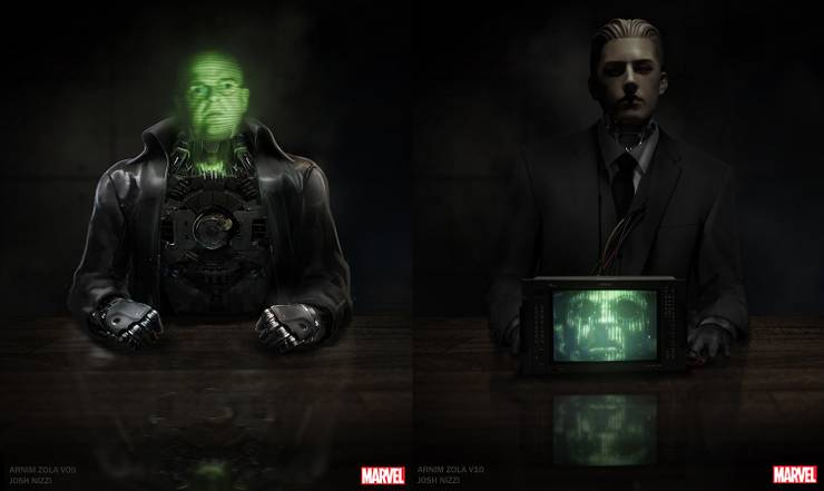
Arnim Zola’s appearance made for an interesting cameo in Captain America: The Winter Soldier, but according to Josh Nizzi’s concept art, the Nazi-HYDRA scientist almost made another cameo in Ant-Man.
Moreover, his appearance would have featured Zola in a robot body, drawing on his comic book origins.
Nizzi put together several designs for Zola’s robotic body, each more unsettling than the last. Given that Ant-Man felt like a true stand-alone movie in the MCU and focused heavily on comedy, Arnim Zola would have changed the nature of the movie considerably.
Zola’s presence has always spelled trouble in the MCU, and he would have added a sinister edge to the lighthearted Ant-Man.
It’s unclear what part he would have played in the story, but since Hank Pym was the robotics expert behind Ultron in the comics, Pym could have had something to do with Zola’s robot evolution.
13 Mystique – X-Men

Rebecca Romjin’s Mystique was a flawless part of the original X-Men trilogy. The filmmakers opted for a clothless look for Mystique, covering her in only her distinctive scaly, blue skin when she is shown in her original form, and her usual red hair is slicked back to give her a streamlined look.
Early concept art used the same element that featured her blue skin, but took her scaly, snakeskin inspired look a step further.
Her hair is spread out to resemble a cobra’s hood, and her eyes are large, yellow slits. The scaly parts of her skin are supplemented by ridged skin like the underside of a snake.
If the movie had taken the snake inspiration to this degree, her portrayal would been more otherworldly and would not have fit as well with the other mutants that she worked beside and against.
12 Vulture – Spider-Man: Homecoming

The Vulture was the perfect villain to begin the new adventures of Spider-Man in Spider-Man: Homecoming. The movie adapted the story of Vulture to tie him more closely to Peter Parker and make the character more appropriate for Michael Keaton’s stunning portrayal.
However, the original design was a bit closer to his part in the comic books.
Although Josh Nizzi’s early concept art had mostly decided upon the style of Vulture’s mechanized wings, this design shows an older, bald Vulture as he appears in the comic books.
This design would have felt less appropriate in the role of the father of a young teenager, which was one of the best parts of Homecoming‘s Vulture. The lighter wings, though, might have added to the threatening silhouette of the Vulture that inspired so much fear in the movie.
11 Scarecrow – Suicide Squad

Suicide Squad brought the unlikely supervillain team-up for the forces of good to the big screen. For all of the movie’s issues, it still had the intriguing element of forcing the superheroes’ greatest threats to work together, and it had outstanding portrayals of iconic villains like Deadshot, Harley Quinn, and El Diablo.
Although it was already an ambitious team-up, it almost had one more member.
Concept art by Ed Natividad shows that Scarecrow was supposed to join the Suicide Squad at one point. Bringing another one of Batman’s well-known foes into the team would have made the villains’ dynamic all the more interesting.
His fear abilities would have also added another element the Squad’s arsenal. The Scarecrow seen in this art had a folksy, farm-like design that would have contrasted with the overly dark designs of the rest of the team.
10 The Mandarin – Iron Man 3

Marvel fans had waited a long time for the appearance of Iron Man’s archnemesis, the Mandarin. Iron Man 3 finally brought this villain to life on the big screen, a seemingly appropriate finale for Iron Man’s solo movies.
However, the movie revealed that the Mandarin did exist and was merely a hired actor– a puppet of Aldrich Killian.
This concept art by Ryan Meinerding shows a different take on the Mandarin. The Mandarin armor and Asian influences in this design reveal that the Mandarin that might have been closer to his comic book origins.
Even with the twist, the recognizable Mandarin would have made for a more worthy portrayal of the iconic villain.
Sir Ben Kingsley was an excellent choice to portray the Mandarin, but he did not get to use his talents to their full effect. In this art, Kingsley takes on a genuinely terrifying air when flanked by the armor.
9 The Lizard – Spider-Man 2

The first reboot of the Spider-Man movies, The Amazing Spider-Man, started off with Peter Parker facing off against Dr. Curt Connors, who became the mutant Lizard after a failed scientific experiment.
Fans were somewhat underwhelmed by the final version of the Lizard, which resembled a human face on a lizard body rather than a full reptile.
Before Doc Ock was decided as the primary villain of Spider-Man 2, the Lizard almost made an appearance in that series. This concept art by Constantine Sekeris shows what Raimi’s take on the Lizard might have looked like.
The Lizard’s inclusion would have been a significant change to the plot of Spider-Man 2, posing a more primal and less calculating threat than Doc Ock provided.
Moreover, this more monstrous version of the Lizard might also have improved his part in The Amazing Spider-Man.
8 Enchantress – Suicide Squad

Suicide Squad‘s Enchantress ended up a rather unimpressive villain for the story, lacking development and not posing as much of a threat as a villain of her caliber reasonably should.
Her final design was also influenced by the overall dark theme of the entire movie, which ultimately limited her visual development to basically the girl from The Ring in a bikini.
This concept art by Christian Lorenz Scheurer shows earlier develop for the Enchantress, a far more impressive and slightly trippy portrayal of the character.
The grand design, overwhelmed by gold and bright color, seems like an appropriate display of power for a formidable magical being. This version of the Enchantress would have stood out in the movie, a striking portrayal of the magic and power that she brought from another dimension.
7 Green Goblin – Spider-Man

Sam Raimi’s Spider-Man trilogy got the landslide of superhero movies started, bringing Peter Parker and his array of interesting villains back to the big screen.
The first movie tackled the Green Goblin in the form of Willem Dafoe’s Norman Osborn. For the Green Goblin’s live-action movie debut, the production team ultimately opted for a design close to the comic book, a mechanical suit with the usual Goblin features.
In one early design by James Carson, the Green Goblin loses most of his distinctive features, opting instead for a paramilitary design.
He retains his glider, but it resembles a sci-fi prop more than Goblin’s glider. Only the glider and bombs directly resemble the Green Goblin, although the Goblin ears are cleverly blended into the costume.
Fortunately, the production team went with the comic-inspired version, as this Goblin would have felt like a strange note of realism in the superhero fantasy.
6 The Joker in the Batmobile – Suicide Squad

When the Joker was announced to reappear in Suicide Squad, fans were eagerly awaiting another incarnation of the playful madman.
The Joker unfortunately only had a small part in the film, appearing mostly in Harley Quinn’s flashbacks and handful of present-day scenes trying to get Harley back.
His part in the movie left a lot to be desired, leaving behind most of the characteristics that made the Joker fascinating to fans.
However, this concept art by Ed Natividad shows a scene that would have had the Joker in genuine form– a small scene mocking Ben Affleck’s Batman.
The Joker is in the Batmobile, apparently leisurely reading while he was waiting for Batman to find him there. It’s an impish, bold move that only a villain like the Joker would pull off, and it’s exactly why audiences love the Joker.
This scene shows what Suicide Squad could have been.
5 Malekith – Thor: The Dark World

Malekith the Accursed was unfortunately one of the most forgettable villains in the MCU. He was developed little within the story beyond being the ruler of the Dark Elves and wanting to release the Aether for his own purposes.
In addition to his lack of development, he was also visually forgettable, designed in the style of an evil henchman from the Lord of the Rings series.
These earlier designs by Andy Park take Malekith closer to his comic book form with a more ethereal look and long, flowing white hair.
His face and clothes are also more refined, a kingly portrayal befitting the ruler of the Dark Elves. His appearance in either of these forms would have been striking, drawing attention to the otherwise unnoticeable villain.
4 Winter Soldier – Captain America: The Winter Soldier

Bucky Barnes’ reappearance as the HYDRA-controlled Winter Soldier was a blow to Captain America, who couldn’t stop seeing his old friend in the brainwashed villain.
When the Winter Soldier is first revealed, he resembles Bucky very little in a streamlined black paramilitary-type uniform and a mask that obscures his face almost entirely.
An earlier design by Josh Nizzi would have created a different dynamic and symbolism within the story. Discarding the mask except for a pair of high-tech goggles, it would have been easy to recognize Bucky from the beginning, assuming that Captain America is better at remembering his friends’ faces than any of Superman’s friends are.
His clothes are also more reminiscent of his World War II uniform, making it easier for Cap to see his friend in the Winter Soldier.
3 Ego – Guardians of the Galaxy, Vol. 2

Ego the Living Planet is one of the most powerful and complex villains the Marvel Cinematic Universe has taken on. Kurt Russell’s Ego was designed to look like a father figure, someone that Star Lord might be able to relate to and trust.
Only later did Ego reveal himself a ruthless villain and show off his true power as a Celestial.
These early designs by Andy Park showed a different side of Ego than the trustable father figure. In the first design, Ego himself is part of his environment, growing into the planet around him, a creepy but symbolic show of the nature of his powers.
The second design shows a younger, more sinister Ego, which would have been representative of his nature as an unaging and immortal Celestial. Both designs would have changed the dynamic between Ego and Peter Quill, prompting a significant variation from the final story.
2 Scarlet Witch – Avengers: Age of Ultron

When Scarlet Witch was introduced in Avengers: Age of Ultron, she was a powerful villain and right hand man of Ultron.
Although she would later reform and join the Avengers, her abilities often made her more threatening than Ultron himself. Elizabeth Olsen’s take on the powerful sorceress was visually unremarkable, a believable henchman with an everyday look that gave no hint as to the extent of her powers.
This early concept art by Andy Park take Scarlet Witch in a different direction, more true to her comic book roots. With her striking outfit and headdress and the otherworldly glowing eyes, she would easily have overshadowed Ultron as the villainous focus of the movie.
This design is more fitting for a supervillain of her power, making her look more like Jean Grey than the average mutant she was intended to be in the story.
1 Joker and Enchantress – Suicide Squad

Suicide Squad‘s villains did not exactly steal the show. Cara Delevingne’s Enchantress was a lackluster villain to match up against the Suicide Squad.
She was supplemented by occasional appearances by Jared Leto’s Joker, who was relegated to a background character. Neither villain felt like an active and present threat for the reluctant heroes.
This concept art, however, gives a glimpse at a Suicide Squad villain team-up that would have inspired real fear. Ed Natividad’s early design shows Enchantress and the Joker working together against the Suicide Squad.
Even with the miscast portrayals of both villains, seeing them together executing their destructive plan would have been an incredible change to the movie.
The Joker’s larger part in the movie would have given fans more of what they wanted, and Enchantress and Joker on the same side would have been a force to reckoned with.
—
Can you think of any other pieces of unused supervillain concept art that would have completely changed movies? Sound off in the comments!
About The Author

Best Posts


Related Posts
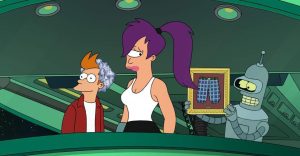
Futurama: Most Memorable Turanga Leela Quotes
Turanga Leela was the stalwart captain of the Planet Express crew on Futurama, and over the years, she got to share some great quotes.
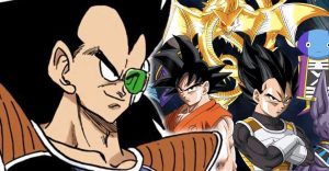
Dragon Ball Super Needs to Give Goku’s Forgotten Brother a Bigger Role
Dragon Ball Super needs to give Goku's forgotten brother a bigger role in current continuity and offer him the same chance at redemption as Vegeta!
The Game Of Thrones Finale Killed Grey Worm (But Only Book Readers Noticed)
Game of Thrones' season finale saw Grey Worm depart for Missandei's home island of Naath - but according to the books, going there will kill him.
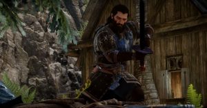
How to Build a Virtually Unkillable Blackwall in Dragon Age: Inquisition
Blackwall makes the best tank in Dragon Age: Inquisition because of his Champion specialization. This build will make him virtually unkillable.
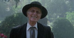
Poltergeist’s “Beast” Explained: How Henry Kane Went From Man to Monster
Ghost movie classic Poltergeist introduced "The Beast," which subsequent sequels would surprisingly reveal was once a preacher named Henry Kane.
Best Cosplays (Updated 2022)
Have you been looking for a great cosplay that you can buy online? If so, check out this list of the best cosplays available for you in 2021.

Netflix’s The Laundromat Cast & Character Guide
Who’s in The Laundromat, and where have you seen them before? Here’s the complete cast lineup for Steven Soderbergh’s latest Netflix feature.

New Girl: 10 Memes That Will Make Devoted Fans Nostalgic
New Girl was hilarious, sweet, sad... a brilliant sitcom! Now that it's gone, we look back at some of the funniest memes from the show.