Kojima’s New Game Really Needs Better Menus Than Death Stranding & MGSV
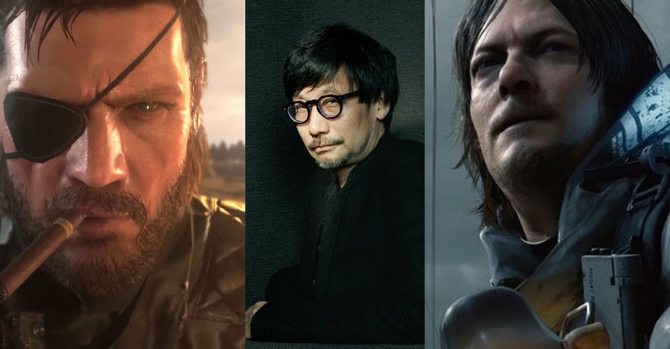
Hideo Kojima is one of the very few video game developers whose name alone has wide recognition. Games such as Death Stranding and Metal Gear Solid V: The Phantom Pain are known as Kojima games. The two are equally strange, with convoluted stories, absurd naming systems, and painfully awful in-game menus. The menus in Kojima’s last two games have been terrible, which is odd for a developer usually so focused on the minutiae of a game’s design.
The menus for both games, on a macro level, work fine. They are aesthetically pleasing, fit the style and color palette of the game itself, and are usually tilted or presented in some way to make them feel as though they are a part of the game’s universe. They are not entirely diegetic since the characters don’t interact with them, but their overall appearance does a fine job of keeping the player’s immersion intact. That said, the menus in Death Stranding and MGSV fall apart completely when it comes to functionality, making the games more annoying to play. The menus’ overall appearance comes off as too sleek, too over-designed, and cluttered.
It sounds odd to complain about menu design, since they are UI elements, but they can greatly affect the enjoyment of a game. Menus may not be considered part of gameplay itself, but they are instrumental in how a player interacts with both Death Stranding and Metal Gear Solid V. Creating unapproachable and obtuse menus have a very real possibility of swaying player opinion on a game, even subconsciously, and better menus would greatly help the accessibility of whatever Kojima’s new game will be.
Death Stranding Suffers Greatly from Poor Menus

It is commonly said that Death Stranding will not entice everyone who tries it. The game is notoriously divisive for its gameplay, and its menus are a legitimate and common critique, especially because so much time is spent using them. Menus are used everywhere in Death Stranding; for taking on new orders, purchasing equipment, organizing inventory, reading emails, loading vehicles, and so much more. Death Stranding‘s systems are tightly designed around one another, but everything in the game, even Sam’s pod-bound Bridge Baby, has its own menu.
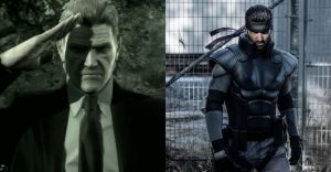
The menus are all blue, and the text is an inconvenient size with lines tightly spaced, and some text is even smaller. The controls for the menus are also listed in blue. The map is all blue. Most of the HUD elements are blue. The game over-explains a lot of things to the player, but does a very poor job of communicating all the little, hardly discernible symbols that are scattered all over every menu in the game. Death Stranding’s narrative is compelling, but the menus are even more frustrating to use than the ones in Metal Gear Solid Vwere, which is made even more disappointing because that was Hideo Kojima’s fifth main entry in that series – one which, at least during games like Metal Gear Solid 2 and MGS3, had fairly intuitive menus.
About The Author
Best Posts


Related Posts

7 Grey’s Anatomy Episodes Where Meredith Almost Died
Meredith is an esteemed doctor who has saved many people, but the Grey's Anatomy protagonist has had several brushes with death in the medical drama.

The Good Place: Stone Cold Steve Austin Addresses Eleanor’s Crush on Him
WWE Hall of Famer-turned-television host, Stone Cold Steve Austin addresses The Good Place character Eleanor Shellstrop having a crush on him.

Which TV Doctor Are You Based On Your Zodiac Sign?
There is an ideal physician for every patient or situation. Here are the 12 zodiac signs and the TV doctors that best represent them.

Big Bang Theory: Why Penny’s Hair Is So Short In Season 8
Penny surprisingly debuted a much shorter haircut in The Big Bang Theory season 8 and there's a deeper reason for this unexpected change.

What We Do In The Shadows: What Guillermo’s Last Name Means
Guillermo’s last name in What We Do In The Shadows has hidden meaning. Besides its literal translation, it means a lot for the upcoming story.

10 Most Lovable Grandparents In Movies & TV
Grandparents in film and television shows are often the most lovable characters around. These are the ones who stick out the most throughout history.

Worst Cooks In America Season 22: Premiere Date & When New Episodes Air
Season 22 of the Food Network's Worst Cooks In America is underway. Eight fan-favorite recruits return to boot camp to compete for $25,000.
Metal Gear: 10 Solid Snake Cosplay That Are Too Good
Solid Snake is as iconic as it gets when it comes to video game characters. Metal Gear Solid fans have cosplayed him in impressive fashion online.