Lizard Was Almost Comic-Accurate In Spider-Man: No Way Home Concept Art
A Spider-Man: No Way Home concept artist has revealed an early, alternate design for the Lizard that is closer to his comic counterpart. No Way Home proved to be the blockbuster event of 2021, breaking numerous records at the box office after cinemas reopened following the COVID-19 pandemic. Audiences rushed to see the first multiversal crossover film in the MCU as Tom Holland’s Peter Parker teamed up with Tobey Maguire and Andrew Garfield’s versions of the wall-crawler to combat villains from across the spider-verse.
These threats included antagonists from Sam Raimi’s original trilogy, like Alfred Molina’s Doc Ock, as well as ones from Marc Webb’s The Amazing Spider-Man series, such as Jamie Foxx’s Electro. Included in the latter camp was also Dr. Curt Conners, AKA The Lizard, an Oscorp scientist who experimented on himself with Lizard DNA and became a reptilian creature. The No Way Home version was modeled after his The Amazing Spider-Man iteration, with actor Rhys Ifans returning to provide the voice.
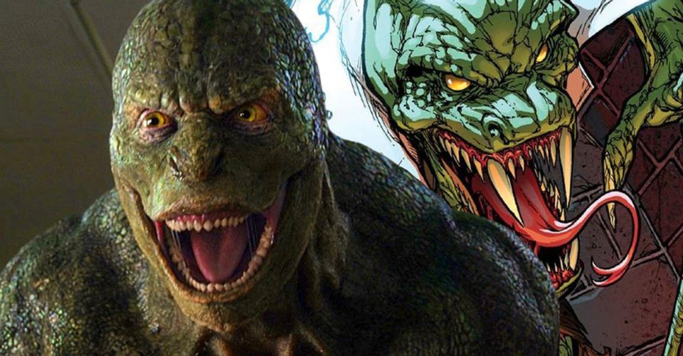
Ian Joyner, a Visual Development Supervisor at Marvel Studios, has released early concept art of an alternate design for the Lizard in No Way Home. The design is starkly different from that seen in his original film appearance and is much closer in line with the traditional comic book look. The Lizard has a more extended snout, as per his comic look, while sporting the lab coat and purple pants that the character is most often depicted in. Joyner’s description details how the aim of the design was to incorporate these comic book elements while also showing how beastly The Lizard had become as his mutation progressed. Check out the tweet below:
Early round of exploration for #thelizard for #spidermannowayhome was to see him in his lab coat (and purple pants!) plus showing that he has grown more beastly. Really fun to think about how he may look as the Lizard took more hold of him. #mcu #spiderman #marvel #creaturedesign pic.twitter.com/8akoLMNFBk
— Ian Joyner (@IanJoynerArt) March 10, 2022
Click Here to View the Original Post
The design is certainly far closer to the character’s iconic look in the comics. Some viewers were disappointed at the lack of these design elements when The Amazing Spider-Man released in 2012 as the torn-up lab coat hung over The Lizard’s hulking frame was a constant visual reminder of the split between man and monster. Even casual audiences may agree that this design looks far more visually appealing than the character’s more humanoid look, which was unfavorably compared to the Goombas from The Super Mario Bros. Movie.
It’s unclear as to why the filmmakers did not elect to use this more comic-accurate design for Spider-Man: No Way Home. The most obvious answer would be that the team wanted the audience to be absolutely clear that this was the same version of the character they saw in the 2012 film. However, Jamie Foxx’s Electro received a radical resign in the film that felt like something of a meta-textual response to the criticism that his original blue design received in The Amazing Spider-Man 2. Nevertheless, while it may be disappointing to fans that this design was never used, it is still an interesting insight into the many stages of production the film went through and the ideas that were at play.
Source: @IanJoynerArt
- Doctor Strange in the Multiverse of Madness (2022)Release date: May 06, 2022
- Thor: Love and Thunder (2022)Release date: Jul 08, 2022
- Black Panther: Wakanda Forever/Black Panther 2 (2022)Release date: Nov 11, 2022
- The Marvels/Captain Marvel 2 (2023)Release date: Feb 17, 2023
- Guardians of the Galaxy Vol. 3 (2023)Release date: May 05, 2023
- Ant-Man and the Wasp: Quantumania (2023)Release date: Jul 28, 2023
About The Author
Best Posts


Related Posts

Meme And Chill: 10 Hilarious Netflix Memes
Netflix isn't a service, it's a lifestyle. These funny & hilarious memes show exactly what we mean as it takes many emotions and life choices.
5 Of The Most Shocking Moments From Dawn Of The Dead (& 5 Of The Funniest)
George A Romero's 1978 zombie horror movie Dawn of the Dead had its fair share of shocking moments, but it also could be funny.

When E3 2021 Officially Starts (& How To Watch)
E3 is back this year as a digital-only event, and there will be many ways to watch the E3 2021 presentations and reveals. Here's everything to know.
You Season 4 Images Show Off Penn Badgley’s New Look As Joe Goldberg
Netflix shared new images from You season 4, flaunting a new look for Penn Badgley as the troubled protagonist Joe Goldberg as he goes abroad.

Should You Play Dying Light Before Dying Light 2
Dying Light 2 is the sequel to the original Dying Light and takes place nearly two decades later, but does Dying Light 1 need to be played beforehand?

LOTR: Why Hobbits Weren’t Fully Corrupted By The One Ring
In The Lord of the Rings' Middle-earth, hobbits are not fully corrupted by Sauron's One Ring, and there are a few different reasons for this.
15 Best Alien/Human Couples Of All Time
Whether it's on the big screen or the small one, aliens and humans have fallen for each other on a surprisingly consistent basis.

The Mandalorian Corrects George Lucas’ Biggest Jango Fett Retcon
Like Boba, Jango Fett was originally a Mandalorian, but was retroactively made a pretender in canon - until The Mandalorian retconned the retcon.