New Warner Bros. Logo Revealed In Video

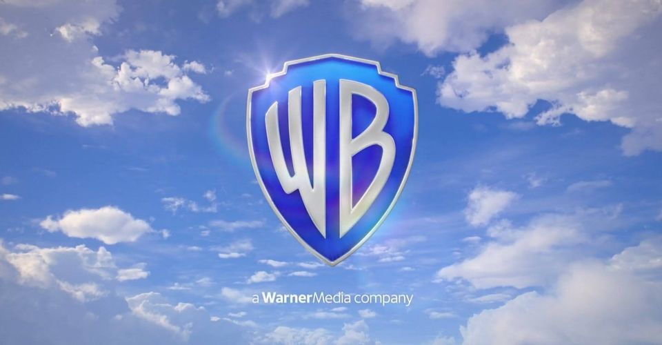
A look at the brand new Warner Bros. logo has been revealed, offering an update for the iconic movie studio. Warner Bros. was first established in 1923 by brothers Harry, Albert, Sam, and Jack Warner, and quickly it became a leader in the film industry. The classic logo has been a staple of all Warner Bros.’ films and the iconic water tower that still stands over the studio lot.
The WB logo has seen a variety of changes over the years, and filmmakers have been encouraged to use stylized versions of it before their films (there have been over 200 variants of the logo in the past 15 years alone). From the 1920s until the 2020s, almost 100 years later, there have been 13 official logo designs; all but one (a three-color version from 1972-1984 designed by Saul Bass) featuring WB initials stamped inside a shield. Now, after Fox’s logo was revamped last year following its acquisition by Disney, Warner Bros. has given its logo a refresh. It has begun to make its official debut before the company’s films.
After 10 years of the previous logo that was seen before films like Wonder Woman and Mad Max: Fury Road, this is what the new era of Warner Bros. will look like, as first seen before the HBO Max Anne Hathaway/Chiwetel Ejiofor heist comedy Locked Down. A video of the logo in action was shared by Cartoon Crave on Twitter:
Here’s a better look at the new Warner Bros. Pictures logo. pic.twitter.com/oANQNvXEOQ
— Cartoon Crave (@thecartooncrave) January 14, 2021
The logo certainly will mesh well with the HBO Max reboot of the Looney Tunes cartoons. It’s definitely the most drastic change to the logo since the aforementioned Bass ’70s version, which was quickly phased out in the ’80s for a return to the more traditional logo. Since 1984, the Warner Bros. logo has mostly acted as a throwback to a style first seen in 1948: gold trim, banner across the shield, superimposed over blue sky with clouds. There have been some minor incremental changes, but they generally haven’t strayed too far, until now.
Warner Bros. may be using artificial intelligence to help decide which movies to make, but the new version of the Warner Bros. logo was actually created by design studio Pentagram ahead of the studio’s centennial in 2023. It features a flatter design with clear lines and ditches the gold for a two-toned blue and white color scheme. Also missing is the “Warner Bros. Pictures” banner and, beyond the WB initials, the new logo is text-free. The blue sky background now has a more realistic look, eschewing the matte painted look of previous versions. While it’s not seen here, there is also a new custom Warner Bros. font (“Warner Bros Condensed Bold”) for use in other media.
Warner Bros. looked to update the logo drastically as it expands further into streaming and digital. There were also complaints that the classic logo, while certainly iconic, was too elaborate to be scaled down properly to items like business cards or letterhead. This new version of the Warner Bros. logo is more streamlined and contemporary, but may take some getting used to for movie fans.
Source: Warner Bros. (via Cartoon Crave)


