Gisnep? Why the Disney Logo Looks So Weird
Why does the Disney logo look so strange? There is perhaps no film logo more instantly recognizable than Walt Disney Pictures, which purports to be the signature of the lauded founder. But why does it not actually look at all like the word “Disney”?
Between Marvel Studios, Pixar, and Lucasfilm, their acquisition of 21st Century Fox and series of live-action reboots, Disney is dominating the box office at home and abroad. Meanwhile, Disney+ and Disney’s takeover of Hulu threaten Netflix’s online market for at-home streaming. It seems like everywhere you turn, the Disney logo is there.
But the Disney logo’s ubiquity doesn’t explain its strange appearance. Why does the “D” at the beginning look like a backwards “G”? Is that last letter supposed to be a “y” or a “p”? Generations of Disney fans have grown up scratching their heads and reading the chicken scratch logo as “Gisnep” as it appeared with the silhouette of the Disneyland Castle. Where did this logo come from − and why does it look so weird?

The logo is modeled on Walt Disney’s own signature, and although his handwriting had some variation over his career, both the “D” and the “y” resemble the autographs that Walt would give to fans. The loop at the end of Disney’s “y” is more recognizable as a flourish in his signature. Disney’s signature also sometimes has a closed “D” with a smaller flourish and sometimes has a lower case “d”. In both cases, Disney’s signature is easier to read than the logo, which makes the width of the lines more uniform and gets rid of some of the smaller distinctions that shape how we recognize different letters.
However, while Disney was founded in 1923 and Disney himself passed away in 1966, the Disney signature were not adopted as a proper logo by the House of Mouse until the 1980s, when they rebranded as The Walt Disney Company and expanded to include home video. The earliest version of the signature appears to be from 1983 home video introduction known as “Neon Mickey,” which features brightly colored, pivoting version of the famous mouse. In 1985, the earliest version of the signature and castle appeared at the beginning of a VHS, featuring a royal blue background, light blue castle, and a white signature. While most Disney films that appeared on video, DVD, and other at-home mediums feature the iconic logo, most older cartoons, including Mickey Mouse cartoons, open with “Walt Disney Presents…” instead.
The logo has continued to evolve over time, with different versions used for the Disney Channel, Disney Store, Disney Parks, and more. With Pixar, Disney introduced the first “3D” logo, adding dimension to the text and making it slightly easier to read. The strange effectiveness of the Disney logo is that whether or not fans read each letter correctly, they instantly associate the logo with the Disney brand and the childhood nostalgia of watching their favorite films.
About The Author
Best Posts


Related Posts
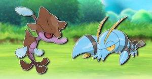
Pokémon GO Dev Warns Fans Of Bug Rendering Skrelp & Clauncher Invisible
A new Pokémon GO Glitch has caused two Pokémon, Skrelp and Clauncher, to appear invisible on the AR mobile game but the support team has issued a fix.
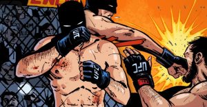
Batman Just Became The UFC Champion in DC’s Universe
Batman fans know Bruce Wayne is one of the most skilled fighters in the entire DC Universe, but he now bears another title: UFC Champion.

How To Get Away With Murder: 10 Times Connor & Oliver Proved They Were Meant For Each Other
Connor and Oliver were easily the cutest couple in How To Get Away With Murder - here's our favorite sweet moments.

Final Fantasy 7: 10 Things You Didn’t Know About Cloud Strife
Famous for his gravity-defying hair and outrageously-large sword, here are 10 things fans of Final Fantasy VII didn't know about Cloud Strife.

How To Get The Mr. Resetti Figure In Animal Crossing: New Horizons
Animal Crossing: New Horizons has added a figure of the save-loving mole Mr. Resetti, and this guide will show players how to get one of their own.

Is Boardwalk Empire On Netflix, Hulu Or Prime? Where To Watch Online
It’s been a few years since period drama Boardwalk Empire aired but fans can still watch the show online via services like Netflix, Hulu or Amazon.

Fortnite Officially Adds Spider-Man’s Green Goblin
Spider-Man rogue Green Goblin has entered the chaotic world of Fortnite, bringing with him a bag of tricks that includes the Goblin Glider and outfit.

James Bond: Why Skyfall Killed Off Judi Dench’s M
Skyfall saw the demise of Dame Judi Dench's 'M' after an almost 20-year run, but why was she killed off in the 23rd James Bond film?