10 Worst Blu-Ray Covers Ever Made
Terrible is a subjective term, but there are times when we can all come together and agree when to label something as truly, awfully terrible. Blu-Ray covers are one such area. Some beautiful works of art have come out over the years, but many Blu-Ray films are cursed with some of the worst designs ever (ill) conceived.
Let’s run down a list of 10 of the absolute worst of the worst. These notoriously bad Blu-Ray covers each deserve a Raspberry award all their own. Take heed, before reading on as you can’t un-see these!
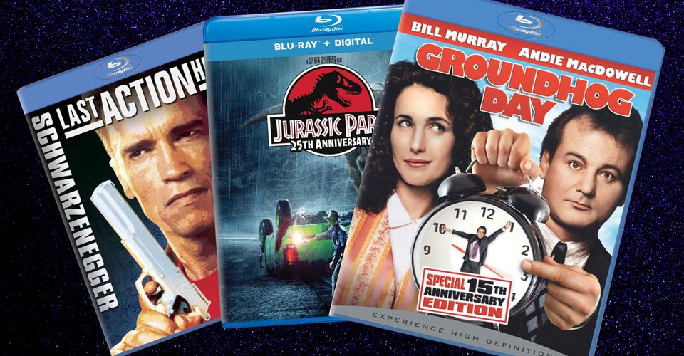
10 LAST ACTION HERO

First on our list is Last Action Hero, a lukewarm Schwarzenegger film with an amazing movie poster that (for some reason) wasn’t used for this particular Blu-Ray release. We hope someone can explain why, at some point.
This single-frame grab was run through a Photoshop posterize filter before getting slapped on the box with boring, awkward titling. The designer didn’t even use the original font.
9 MINORITY REPORT

Say what you will about Steven Spielberg’s art-deco sci-fi crime thriller. This Blu-Ray cover put the “minor” back in Minority Report. Improperly conceived and poorly executed, it attempts to build something resembling a narrative, but nobody can tell what it is.
Tom Cruise looks like he wants to crush the titling on the cover with his thumb and forefinger, while the cityscape backdrop serves absolutely no purpose.
8 IN THE LINE OF FIRE

Love the movie. Hate the cover. This is a lot of laziness wrapped up in one package, with so many design errors that it shouldn’t have made it past the first draft.
First off, there are two identical, redundant Clint Eastwood’s on the cover that face in either direction. Everyone is looking off into the distance, except for Rene Russo, who looks like she’s about ready to devour us like a Black Widow spider.
7 VOLCANO

This doesn’t look like anything like a volcano. Rather, it looks like Tommy Lee Jones was cast in the next Mission: Impossible film, and doing his best Tom Cruise running impression to escape a barrage of artillery fire and explosions.
Also, Jones isn’t that skinny, nor is his head that large in proportion to the rest of his body. Supposedly the “artist” in charge tried to convey the destructive power of said volcano. In reality, it’s a failed attempt.
6 THE ROOM

The Room should be mandatory viewing (by law, no less) so that everyone can see what happens when an idealistic director gets his hands on some cash and decides to make his own movie. It’s since gone down as one of the most notorious cult films of all time.
Why the Blu-Ray shipped with this artwork, however, is anyone’s guess. That forehead has been subjected to some tremendously careless Photoshop Liquify and haphazard Healing Brushing, turning the whole design into a distorted, blurry mess. You are tearing us apart, Tommy!
5 PRIMAL FEAR

Never mind how silly the subtitled “Hard Evidence Edition” sounds. Primal Fear loses all sense of a thriller movie thanks to this Blu-Ray cover. It’s obvious the designer was attempting to do something special for this release, but it’s all wrong.
The red “evidence” tape across the top, the warning label, and the poorly utilized photographs do nothing to sell what this movie was all about. Even comedy films don’t go this far out of the box.
4 NATIONAL LAMPOON’S VACATION

The original 1980s movie poster for National Lampoon’s Vacation was iconic, and stitched firmly into the decade it was made. For some reason, this is what the studio went with for the Blu-Ray release.
Chevy Chase isn’t lit properly in comparison to the bland background, and his flying stationwagon looks preposterous with a trail of bad Healing Brushed smoke and dirt running close behind it. It also doesn’t appear like anyone’s driving the car, which is a great metaphor for this cover design in general.
3 SPIDER-MAN

Insulting is not the word, but we’ll err on the side of caution for the sake of this list. Raimi’s Spider-Man trilogy got one of the most notorious box art treatments in history, and it has so far remained close to the top as a textbook example of “lost the plot.”
The solid navy blue background color is horrifying by itself, but it’s made worse with the addition of two severely bad facial cutouts of Spidey and Gobby, both of which are topped off with a Photoshopped drop shadow. It’s a sin, by every single standard.
2 JURASSIC PARK – 25TH ANNIVERSARY

The list of flubs on this cover is startling. First, Alan Grant is waving his flare around while staring to the left, seemingly oblivious to the fact that a T-Rex is charging at his right. In the film, it charged at Ian Malcolm, not Grant. As such, both human and dinosaur are completely out of place in relation to one another.
Then there’s that lens flare. Why, oh why is there a lens flare? When tallied up, this is hardly the kind of cover befitting a 25th Anniversary release of such a groundbreaking and beloved adventure film. For shame, if you can feel it.
1 GROUNDHOG DAY

We chalk this one up to disturbing because no other word truly fits. In fact, nothing about this cover fits, in any way. Andie MacDowell appears detached from the scene, and there’s no reasoning for her staring up and to her left. Meanwhile, the hack-job on Bill Murray’s face is worse than a thousand uncanny valleys thrown into a blender and served with a side order of fruit.
His eyes are mismatched and grotesquely out of proportion, his face is waxed to a sheen, and his pointed finger hand doesn’t match up with the rest of his body. Also, who points like that, with their thumb in that position? Once more, another Anniversary Edition gets the negative treatment. It almost feels as if the studio didn’t want this release to sell a single copy. If you saw it on the sidewalk, you’d probably cross the street to avoid it.
About The Author
Best Posts


Related Posts
Trench Bunker Easter Egg in Modern Warfare (What is it & How to Unlock it)
Season 4 of Modern Warfare comes with a handful of new editions. Trench, the new 2v2 gunfight map, comes with a hidden surprise of its own.
15 Most Ridiculously Named Superheroes
Although they all fight bad guys in the name of justice, there are those unfortunate superheroes who are burdened with some pretty ridiculous names.
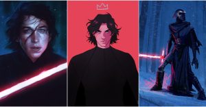
See You Around, Kid: 10 Awesome Fan Art Pieces of Star Wars’ Kylo Ren
Kylo Ren was easily one of the most compelling characters of the Star Wars sequel trilogy and these fan art pieces perfectly capture that quality.
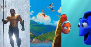
10 Movies About The Ocean To Watch Before Pixar’s Luca
Pixar's Luca has audiences preparing by watching the best movies about the ocean. The Disney+ movie will start streaming on June 17, 2021.

David Fincher: His 10 Most Popular Music Videos (According To YouTube Views)
David Fincher's signature style can be all traced back to his best music videos, where he developed into one of today's most acclaimed directors.

The MBTI Of Toy Story Characters
The Toy Story movies have some of the most iconic Pixar characters ever. But how do heroes like Woody and Buzz fall into the MBTI personality system?

90 Day Fiancé: Patrick Cornett Reveals He Recently Got Married
90 Day Fiancé fans may remember B90's Patrick Cornett and his failed romance with Myriam Mana. The Vegas-based DJ reveals he recently got married.
Square Enix Will Open Its First Large-Scale Theme Park in 2020 (But It’s Not What You Think)
Square Enix's Live Interactive Works is set to open its first large-scale theme park in Tokyo this year, but it won't be based on any games.